

The new Facebook UI: As unsettling as 2020

Facebook has been going through a rough phase. From having major advertisers pull out ads from the platform, to being summoned by the US Congress every other week, the company is having to deal with a lot.
Basically, Facebook has 99 problems, and instead of dealing with them, they decided to reach for the 100-mark milestone, and introduced a new user interface (UI).
Facebook started rolling out the new FB5 design as an optional switch to its users sometime around March of this year. However, the platform has now made the new UI permanent for all its users starting September, killing off the old "classic" layout in the process.
And as expected, many users are not happy with this decision.
When you open the new design, you'll immediately realise that Facebook was going for a more minimalistic look. To do so, the platform had to make major changes to the design.
The new homepage has a three-column layout, ditching the old four-column look. Previously, the shortcut and explore bar were on the left of your screen, followed by your main newsfeed, the sponsored and suggestions section, and finally your chat or contacts section. In FB5, the sponsored and suggestions section is merged with the contacts bar. This puts the newsfeed right at the centre of your screen, and makes everything look a lot bigger than before, not to mention the rounded corners. Cringe.
However, there's a problem with this. Turns out that the new layout will work fine on small, or normal-sized screens. Anything that's wider than 1200 pixels will end up leaving a gap around the main content.
Then there's the issue with how everything's arranged in this new look. In an attempt to create a more compact view, Facebook seems to have made everything look more confusing, and yet couldn't manage to get rid of the redundancy that's still there.
Apart from visual flaws, the new design is disappointing in terms of functionality as well. Some of the previous features are missing in the new Facebook, or is yet to be implemented. One of the biggest features that seems to be missing is the option to prevent users from sending you invitations to join a particular Facebook group after you've declined it once, something that was available in the old version.
There are also a few glitches in this new design, and although I believe those are mostly due to a lack of cross-browser compatibility, I still think that a tech giant like Facebook should've done a better job at this. Even if they say that these issues will eventually be fixed, it simply means that they've released an unfinished product, and are trying to shove it down our throats.
Hence, it's easy to understand why people aren't that fond of Facebook's new look, and although we'll eventually get used to it, it's going to be a bit unsettling to use the platform for the time being.
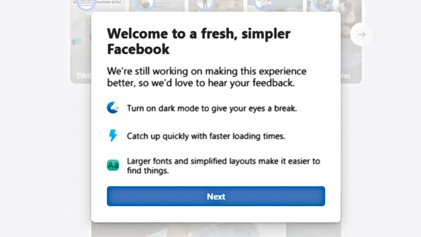
Well, at least they have dark mode now.
 For all latest news, follow The Daily Star's Google News channel.
Comments