Microsoft gets new logo

For the first time in 25 years, Microsoft has changed its corporate logo recently.
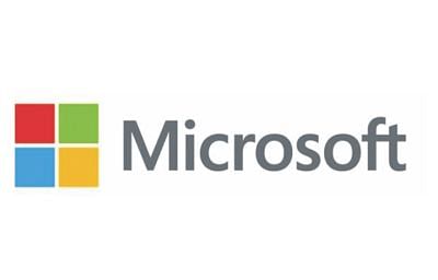
The new logo, which incorporates a multicolored Windows symbol in addition to the "Microsoft" name in straightforward, lighter type, is intended to "indicate the heritage but also indicates a newness and freshness," said Jeff Hansen, Microsoft's general manager of brand strategy.
The new logo features the name "Microsoft" in the Segoe font, a font Microsoft owns and has used in its products for several years. The font also figures prominently in the new Windows 8 user interface.
The "F" and "T" in the name "Microsoft" are connected in the new logo, just as they were in the old. For the first time, the company's logo also includes a symbol, four multi-coloured square tiles.
The colors in the squares, blue, orange, green and yellow, are associated with Microsoft and from which the company's product brands draw.
The colours are also meant to convey "the diversity of Microsoft products and the diversity of people that the company serves.
The new logo also bears great resemblance to, and is an evolution of the Microsoft Store logo, which was inspired by the Windows flag.
The new logo marks the fourth time Redmond-based Microsoft has changed it since the company was founded in 1975 and only the second time since Microsoft has gone public in 1986.
Microsoft's first logo, used from 1975 to 1979, evokes its era, with its disco-y typeface. The multil-ined logo, with "Micro" on the first line and "Soft" on the second, reflects how co-founders Bill Gates and Paul Allen supposedly came up with the original company name "Micro-Soft" something that reflected both "microcomputers" and "software."
The second logo, with some jagged edges and strong diagonals, was used from 1980 to 1981 and reflected the computer and video-game culture of the time.
The third logo, used from 1982 to 1986, introduced a stylised letter "o" with lines through it.
The Microsoft logo most people are familiar with today was the one the company started using in 1987. It featured a slice in the "o," a connection between the letters "f" and "t." Compared with the earlier logos, it looks more solid, stable and corporate.
The new logo will be used on a new wave of global TV commercials in the next few weeks and on the new products being released this fall and into the holiday season.

 For all latest news, follow The Daily Star's Google News channel.


Comments